PLAY ME


historic
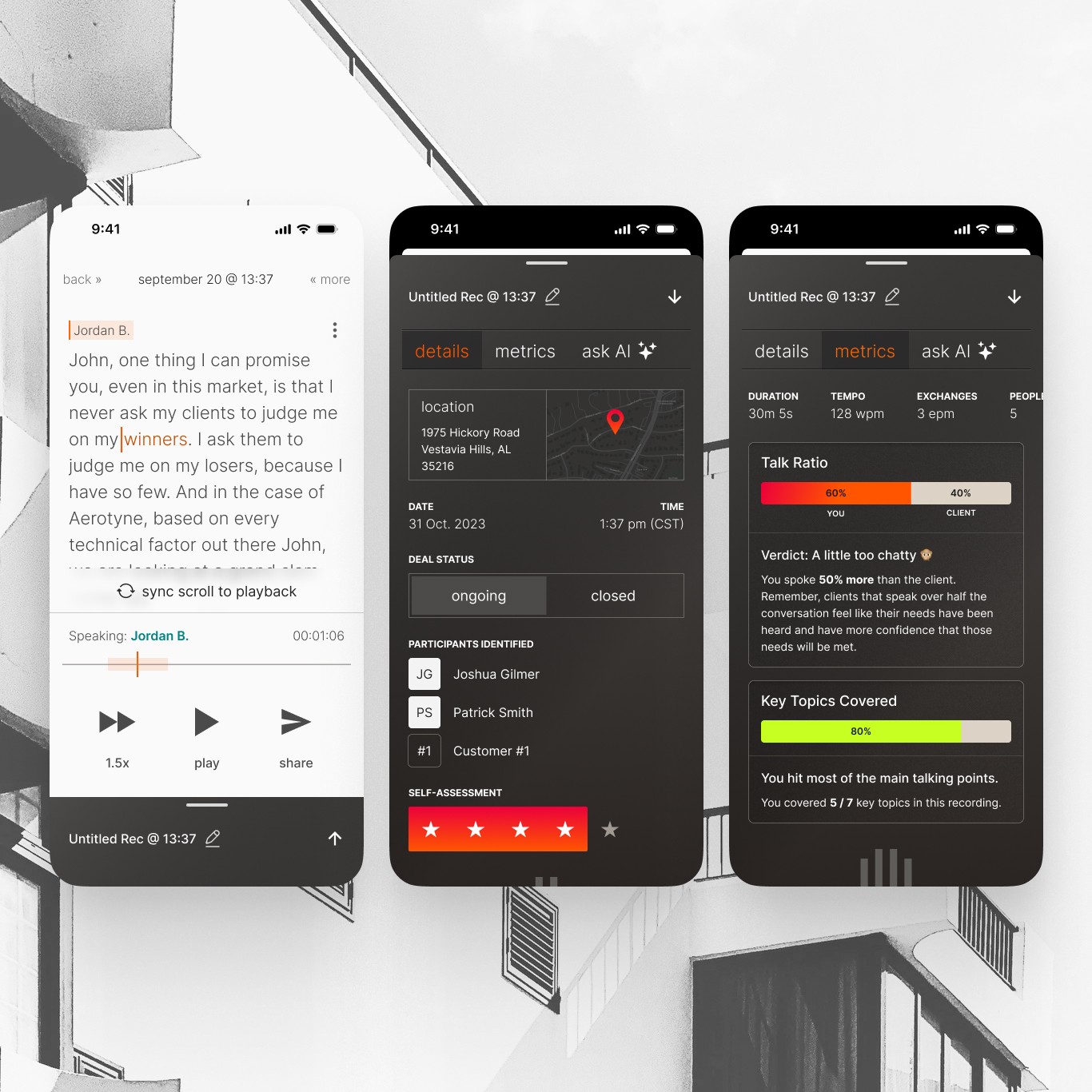
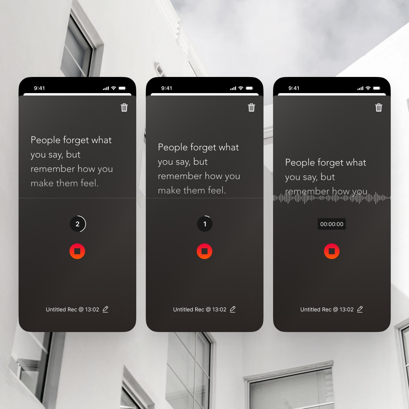
I simply love a blank canvas. For historic, everything was created from scratch. The brand, the colors, the copy and design—all of it new. The majority of this work was done within 60 days as part of an X project for Linq. And most of the work was done at least twice. Why? Well, we toyed with 4 different brand names before landing on historic. We oscillated between a top-down and bottom-up go-to-market strategy. We shifted from ideas of a Neobrutalism UI to more of a Swiss design style rooted in minimalism and with a touch of Neoplasticism.
The long-term vision for the product was an ecosystem that could record your life, giving you a true second-brain, digitized with perfect recall. When I saw some relatively cheap domains for the word historic, I jumped. A lot of the design takes inspiration from Teenage Engineering. We wanted to convey high-end sophistication. The clean look and feel is something I would design for myself, but hey, you're on my portfolio now so you can see that for yourself.
More Case Studies
All content ©2025
All content ©2025

